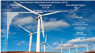
MM_2019_W8; 2 dashboards this week; Images | Hex Maps | Scatterplots with labled axis lines

This week I ended up writing 2 viz's of totally different directions. My first iteration had a few learning lessons (using a background image; some tricks about BAN (big !@# numbers; some axis tips\tricks). Then I listened to the weekly MM review and got inspired by Andy's demo at the end with a scatter-plot, so decided to try and replicate that and add some 'flavor' to the story. I actually liked both this week but am continually trying to not just present the data but 'tell the story' so the 2nd iteration was very important to me. Below are my tips I discovered this week. Tableau Public link to viz's; Lessons Learned: Viz #1 (with image) I sometimes need to switch the axis to have the axis flip. I ended up not using this but found the blog interesting; https://www.thedataschool.co.uk/elnisa-marques/moving-table-headers-bottom-measure-axis-top/ From a data perspective; I had to change Text to Measures; format to number...
