MM_2019_W8; 2 dashboards this week; Images | Hex Maps | Scatterplots with labled axis lines
This week I ended up
writing 2 viz's of totally different directions. My first iteration had a few learning lessons
(using a background image; some tricks about BAN (big !@# numbers; some axis
tips\tricks). Then I listened to the weekly MM review and got inspired by Andy's
demo at the end with a scatter-plot, so decided to try and replicate that and
add some 'flavor' to the story. I actually liked both this week but am
continually trying to not just present the data but 'tell the story' so the 2nd
iteration was very important to me.
Below are my tips I discovered this week. Tableau Public link to viz's;


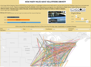
Lessons Learned: Viz #1 (with image)
- I sometimes need to switch the axis to have the axis flip. I ended up not using this but found the blog interesting; https://www.thedataschool.co.uk/elnisa-marques/moving-table-headers-bottom-measure-axis-top/
- From a data perspective; I had to change Text to Measures; format to number (data type to number). In Andy's demo; he did this from the beginning in the .xls sheet. So very important to examine your data from the very beginning.
- Images behind data; Make sure the sheets are floating; this can be a challenge to get everything lined up appropriately with colors/sizing etc. but images are fun and give a different perspective to your dashboards. ** Make sure you site your images.
Lessons Learned: Viz #2 (with scatterplot and hex map)
- Being able
to see what you've changed in your fonts etc: This is something Andy had in his demo that I
never knew before; you can see
bolding in your coding if the original has changed. To get it back to original, just right
click and clear . NOTE The bold on numbers below

- Captions; another trick Andy used in
the demo was to 'show caption'; that way you don’t have to fool with text
boxes etc. So in the worksheet,
make sure you show caption (this is where I noted that we excluded Rhode
Island because it was such a huge outlier). Make sure you turn on the caption in
your dashboard as well.

- Scatterplots; Andy went through the detail on how to add a reference line with averages in the demo. It was very nice to be able to point out to the reader what the various 'boxes' represent. He ran out of time to really get into the detail of pulling this into a map, so I went ahead and finished the thought for him. The demo was at about 54minues into the brightalk webinar. Andy did some great stuff with exploration and scatterplots and incorporated the hex map into his viz. In 2019_W3 blog, I talk about the how to on hex maps (essentially this link by Ken Flerlage). I really liked being able to label the various pieces of the scatterplot this week with the reference line and the formulas (see below).

- Here are the formula's used to plot the regions in the graph;


IF
[Investment Per Project] > WINDOW_AVG([Investment Per Project])
and
[Investment Per Homes Powered] > WINDOW_AVG([Investment Per Homes Powered])
THEN 'High Investment Per Home & High Investment Per Project'
ELSEIF
[Investment
Per Project] > WINDOW_AVG([Investment Per Project])
and
[Investment Per Homes Powered] < WINDOW_AVG([Investment Per Homes Powered])
THEN 'Low Investment Per Home & High Investment per Project'
ELSEIF
[Investment
Per Project] < WINDOW_AVG([Investment Per Project])
and
[Investment Per Homes Powered] < WINDOW_AVG([Investment Per Homes Powered])
THEN 'Low Investment Per Home & Low Investment Per Project'
else
'High Investment Per Home & Low Investment Per Project ' END
- This is how I coded one of
the reference lines;


Comments
Post a Comment