MM_2019_W03 | Hex Maps | Adding Color Pallet | Highlight Bars in Chart
Hex Maps | Adding Color Palette | Highlight Bars in Chart
This week we'll talk about these topics.
- How to do I go about approaching the topic and my direction.
- Lessons learned
- Resources
- How do I approach the Topic;
- Learn from others\refresher; I have to be honest, because I am so new to Tableau and want to learn as much as possible as I am working on my weekly viz's, I often look at others and see if something resonates with me. Eva and Andy have been talking about keeping things simple lots lately so I try to focus on that when I look at other's viz's. I also either try to pick at least 1 new learning lesson (easy to do at this stage) or something I haven't focused on for a while for a refresher.
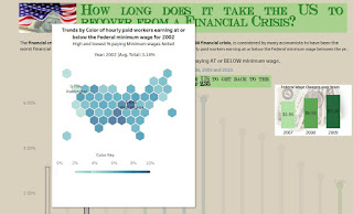
Level of Detail (or top down approach). Many times when I worked with SAP Business Objects, clients would want to drill into data and that capability was a bit stifling in the tool (had to create hierarchies at the universe level (Admins only) or do links to other tabs in the tool). So, that capability is very exciting to me in Tableau. Lately I have been using viz in tooltips for this and hope to expand more on this soon with set actions.- What is the story in the viz? The cool thing with MM is that there are so many readers that do a great job at creating stories that get pulled from the data. The overwhelming theme this week was how long it has taken to bring up wages to the pre-recession levels (2008). So, I decided that was my focus. In the review session, Andy and Eva always seem to ask, what is the story? So this week, I decided to push it with specific highlights and fonts. I did a few things.
- Question & Answer in the viz. I actually took the question and answer out of Tableau fonts and used power point (ppt) [Thanks to Ken Flerage's awesome blog on using power point in tableau for this that I've gone back to many times] to play with fonts and images to help direct the reader to the story line. Here is the question and answer; [I actually downloaded a currency font for this]
- Highlight specific points. Thanks to Anna H. Dzikowska for her insight on this. By breaking down Anna's viz, I was able to figure out how to just highlight certain bars in the viz through a formula. I talk more about the detail on this later. So, I highlighted the bars to help the reader focus on this. Additionally, I tag the %age numbers for these significant bars. If the reader wants to see the detail behind the other bars, they just have to hover over the bar to see the detail (plus other pieces I'll talk about later).
Chart Approach; This
week; many others did Hex maps (more on that later as to why it is suggested to
do this instead of a traditional map) which worked well but I felt that was a
bit overwhelming to the end user to consume.
So, I took the summary to drill approach. So inside the Lollipop Chart (really just a
dual axis with bar and circle chart) tooltip, you will see the hex map of that
specific year and the data for the US % of workers at or below Min wage. I know the color is a bit rough and
inconsistent with the viz, but I had added the plasma color pallet (more later
on the how to for this) and wanted to use this cool color pallet so
stuck with it. (after the viz review decided to change the color; see below).
The reader can quickly see if there are trends in higher or lower minimum wage
payments just by looking at the colors. I added another sheet (tooltip) to be able to read the color pallet.
Revised Version after the viz review as these colors really
were not consistent with the viz and made the labels I wanted to highlight hard
to read.
- Lessons Learned\Lessons still struggling with
- Formula to pull in highlight bars
- First I created a Formula to convert the Year to a String STR([Year])
- Then
I created this formula to be able to pull the various years out to focus
on;If [Year highlight] = '2009'
then 1
ELSEIF [Year highlight] = '2008' Then 1
ELSEIF [Year highlight] = '2010' Then 1
ELSEIF [Year highlight] = '2007' THEN 0
ELSEIF [Year highlight] = '2017' THEN 0
Else 2
END
- I then added the above formula (named Years - Focus ) to the color pill and assigned my colors appropriately
- Adding color Palette; First I wanted to use a cool plasma color palette that I had seen but not delivered out of the box with Tableau (but as you see later decided to go with a more subdued color pallet). For sake of learning; here is how you add a color palette; Tableau Link.
- Find our Preferences.tps file and copy it with a different name (for backup purposes). Repository is located in; C:\Users\<Windows User>\Documents\My Tableau Repository
- Edit your preference file with the new code you want; (you have to use a text file to open it)
The file is a basic XML file that you can open
in a text editor to modify. An unedited preferences file looks like this:
- I found some palette's here; (thanks mikecisneros1 )
- Add the new code between the <workbook> pieces; (see below); you will need to close tableau and come back before you will see it again.
TOP
BOTTOM;
- Hex Maps: Ken Flerlage has a great blog on how to here; Hex How to. As Ken Mentions; the reason we use a HEX map instead of a regular map is; Additionally, standard US maps create the “Alaska Effect”. The Alaska Effect is where the lower 48 states are greatly minimized due to Alaska’s size on a map and its location far to the Northwest. Hex maps eliminate this issue as well because all states are equivalent in size and Alaska and Hawaii are brought in closer to the lower 48 states
- Few key pointers: You will essentially pick a spatial file to use and then join it to your other data by state. A spatial file is a file that defines the geometries required to create a map. In the Viz review demo towards the end from this week; Andy shows you how to do the join (and do a hex map) although I feel he went through it pretty quick.
- Once
you download the file; in tableau (it will be downloaded as a zip
file). In Tableau, go to Data > New Data Source, and choose
“Spatial file”.
And a few notes on using it:
- Just double click the Geometry field to have Tableau generate the hex map! (this will create a longitude\Latitude on the Columns\Row shelf)
- You’ll want to washout the map completely as you won’t want to see the background map, so go to Map > Layers and wash it out:
- You’ll also want to go to Map > Options and remove all the interactivity that doesn’t really make sense
- I wanted to have all the years on one page; so I created a Column and Row calculation Column: fieldABS(FIRST())%ROUND(SQRT([Size])) Row; INT(ABS(FIRST())/ROUND(SQRT([Size]))) for positioning and put them in the Col\Row shelf.
Other
formatting included doing min\max for labels on the maps | taking away Axis |
boarders etc.
- In my tooltip; I wanted a key to the color; so I had to create another sheet with just the key, which is a bar chart with a min\max of the totals.
- Viz inside of tooltips; last I needed to bring in the 2 viz's for my tooltip . In my head, I thought I had to filter the tooltip on the year but then had issues (I had to actually go to the Tableau forum to get assistance on this one; see Link to help here:
- This is the syntax for my tooltip;
Trends by Color of hourly paid workers earning at
or below the Federal minimum wage for <Year>
High and lowest % paying Minimum wages Noted
Year: <Year> |Avg.
Total: <AVG(Total)>
<Sheet name="Hex2"
maxwidth="400" maxheight="250" filter="<All
Fields>">
<Sheet name="Color Key"
maxwidth="300" maxheight="200"
filter="<Year>">
- STILL Struggles; with you do dual axis chart; how can I get my labels to NOT touch the bar? The one thing I am still struggling with is getting my numbers above my dual axis chart to be higher than the bubble.. I may reach out to the forum again to see if I can rectify it as it is bugging me.. :-)
- Resources (recap)
- Anna H. Dzikowska
- Ken Flerlage; Hex How to
- Kevin Flerlage; Power Point in Tableau
- OverallViz review from this week (if time is an issue; go to the last 10 mins or so for the demo's)
- Tableau community Forum (thanks Claire Smith) for help with my viz inside tooltip issue; https://community.tableau.com/thread/292802


Nice write up!
ReplyDelete