MM_2018_W52: Viz inside Tooltip | YOY Formula | Dual Axis reference Lines
This week I am breaking all the rules on Color Blindness!
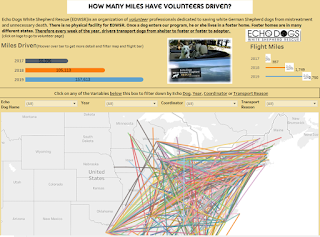
NOTE: It is not advised to use Red & Greens in your viz's as it is very difficult for anyone who has color blindness to be able to read. I decided to just go with the Christmas colors so I apologize to any color blind readers out there. Here is my final Viz;

What I learned this week;
1. how to put a viz in side a viz tooltip
2. how to do a formula that looks at a Year over Year comparison (YOY)
3. Struggled with a Dual axis reference line and doubling.
1. Tips of Viz inside of Viz; This is what I ended up with for the tooltip

This is what is inside of my tooltip; tricky thing here is that I formatted the sheet by size.
<Year>
Avg Spend: <SUM(Christmas spend in US$)> | YoY Change: <AGG(YoY Change)>
<Sheet name="Trend" maxwidth="400" maxheight="200" filter="">
2. Formula for YOY % ages. This is the formula I used for YOY comparisons to just look back at the previous year; (ZN(SUM([Christmas spend in US$])) - LOOKUP(ZN(SUM([Christmas spend in US$])), -1)) / ABS(LOOKUP(ZN(SUM([Christmas spend in US$])), -1))
This is what the pieces of the formula are doing;
ZN; if expression = Null then 0 else expression end
Lookup; LOOKUP(expression, [offset]); Returns the value of the expression in a target row, specified as a relative offset from the current row. If
/ is just calculating the %age
3. Dual Axis Reference Line; Initially I was going to use this viz:

It is just a dual axis basic barbell type chart. But I didn't like it after I made it. But one thing I learned was how to get the Average (762) line amount from NOT replicating. You have to Go into 'Format Reference Line' and change the alignment of the reference line label Hide 2nd reference line on dual axis to whatever you want (left, right, or center). This seems to force the two labels to get stacked so it only looks like a single label.
NOTE: It is not advised to use Red & Greens in your viz's as it is very difficult for anyone who has color blindness to be able to read. I decided to just go with the Christmas colors so I apologize to any color blind readers out there. Here is my final Viz;
What I learned this week;
1. how to put a viz in side a viz tooltip
2. how to do a formula that looks at a Year over Year comparison (YOY)
3. Struggled with a Dual axis reference line and doubling.
1. Tips of Viz inside of Viz; This is what I ended up with for the tooltip
This is what is inside of my tooltip; tricky thing here is that I formatted the sheet by size.
<Year>
Avg Spend: <SUM(Christmas spend in US$)> | YoY Change: <AGG(YoY Change)>
<Sheet name="Trend" maxwidth="400" maxheight="200" filter="">
2. Formula for YOY % ages. This is the formula I used for YOY comparisons to just look back at the previous year; (ZN(SUM([Christmas spend in US$])) - LOOKUP(ZN(SUM([Christmas spend in US$])), -1)) / ABS(LOOKUP(ZN(SUM([Christmas spend in US$])), -1))
This is what the pieces of the formula are doing;
ZN; if expression = Null then 0 else expression end
Lookup; LOOKUP(expression, [offset]); Returns the value of the expression in a target row, specified as a relative offset from the current row. If
offset is omitted, the row to compare to can be set on the field menu. This function returns
NULL if the target row cannot be determined. In the formula above, it is going back 1 row to the previous year./ is just calculating the %age
3. Dual Axis Reference Line; Initially I was going to use this viz:
It is just a dual axis basic barbell type chart. But I didn't like it after I made it. But one thing I learned was how to get the Average (762) line amount from NOT replicating. You have to Go into 'Format Reference Line' and change the alignment of the reference line label Hide 2nd reference line on dual axis to whatever you want (left, right, or center). This seems to force the two labels to get stacked so it only looks like a single label.

Comments
Post a Comment