Tableau Maps; Lessons Learned
I created another viz for an organization I volunteer with
to help in recruiting and marketing. Here are my notes.

What was my purpose?
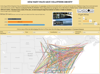
- Always important it what is the question you are answering to pose to your readers. My overall goal was to show how much volunteers do for this organization and that transpired into how many miles have volunteers driven through the years.
- I also wanted to recruit more funds and/or drivers and of course a visual representation through Tableau immensely helps that!
What was a challenge?
- Plotting the longitude/latitude for all the small towns that the doggies came from and were going to took a bit of time
- Cleaning up the data (as always!); combining all the data into 1 sheet and adding Start/Ending latitude/longitude
- Plotting the airlines miles with the data as opposed to separate but still being able to filter it out for a specific visual.
What I learned
- How to do a QUICK map in Tableau (I am using 2019.4.0) with the below formula. I was able to use this formula to just pull the Start/End routes of Lat/Long. I just put this formula in the detail section and then added Dog name to color and the map was made;
o
Formula: MAKELINE(MAKEPOINT([StartLat],
[StartLong]), MAKEPOINT([EndLat], [EndLong]))
o
Once I put the routes in the Detail section the measure
was transformed to ‘Collect’ and the lat/long filled into the columns/rows.
- Make is easy as possible for non-tableau Users to consume the visual
o
Filters; Because the map is so busy; I
knew filters were key. I tried to interpret what the readers might want to
filter the day by and came up with Dog Names (for current owners), Year,
Coordinator, Transport Reason
o
Dashboard Actions; I used the dashboard
actions so if users hovered over a bar the map transformed to read the year
as the map was already very busy. Here is what the action looks like (Under Dashboard Actions)

What could be Better;
- I would have liked to have a cleaner data set for transport reason but I do not control or keep this data so I had to take what was available to me.
- I don’t really like the airplane icon I came up with and know there is a better way to represent this data. I am sure I’ll change it at some point. (suggestions welcome!)
Viz Location;

Comments
Post a Comment